Brasil – União de Todos
Image
Details
Client: Governo Federal do Brasil (Brasília, DF)
Designer: Secretaria Especial de Comunicação Social (SECOM) (Brasília, DF)
Years in use: 1992-1994
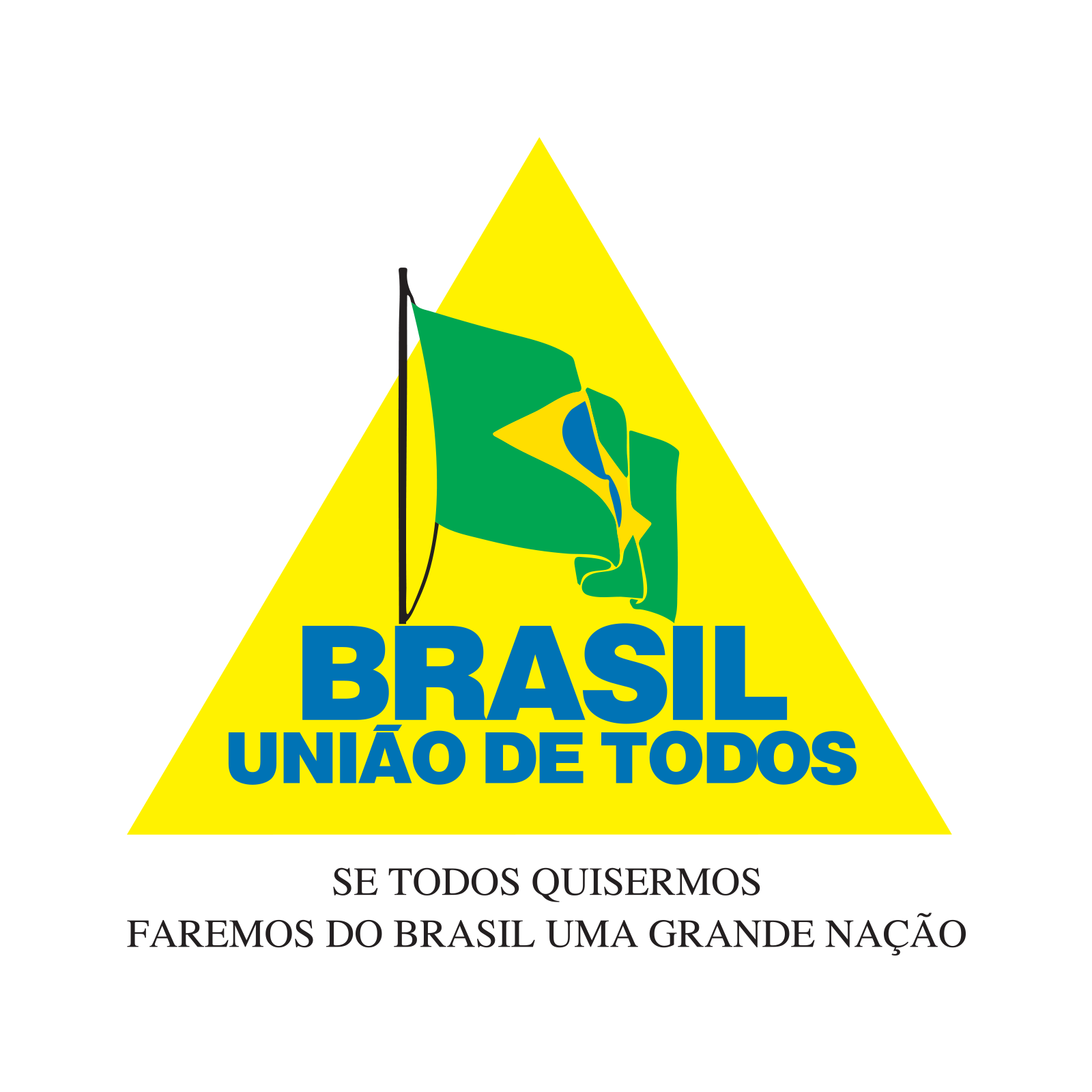
Remarks: The visual identifier used during the Itamar Franco government. Similar to the Temer wordmark, the early publication date (Franco did not formally assume the office until extremely late in the year, 29 December 1992) likely stems from serving as acting president during impeachment proceedings against his predecessor. A Brazilian flag waves in the simulated breeze, superimposed over a yellow triangle that is reminiscent of the flag of Minas Gerais, the state of which he was a native. What appears at a glance to be a four-colour logo is, in actuality, a five-colour logo. The yellow of the lozenge on the flag, CMYK(0,10,100,0), contains 10 per cent magenta to distinguish it from the CMYK(0,0,100,0) triangle. A bold neo-grotesque face beneath the flag reads Brasil, União de Todos (“Brazil, Union of Everyone”) in blue. The graphic standards do not specify a typeface, but NBN has found the display weight of Scangraphic’s Europa Grotesk to be a very close match. Any other bold Helvetica clone would serve just as capably.
União de Todos, however, is not the slogan associated with this mark. The standards manual refers to it as a legenda (“caption”), while the lema (“motto/slogan”) is displayed in Times Roman beneath the triangle:
Se todos quisermos, faremos do Brasil uma grande nação.
This is an adaptation of a famous quote from early Brazilian revolutionary Triadentes, which translates to:
If we all want to, we’ll make Brazil a great nation.
Interestingly, Tiradentes and the Inconfidência Mineira separatists who wished to break away from Portuguese rule proposed a flag bearing a triangle to be the national flag of Brazil.
There are two known variants of this logo. The first, and the only one NBN has seen described in the standards guide deposited with the Presidential Archives, features the flag waving quite vigorously while attached to a mast and halyard. On the second, the flag is larger and flapping more leisurely, seemingly suspended in mid-air. The latter example is much more commonly cited and displayed in both scholarly articles on the topic and the contemporary press. And NBN does not believe it to be invalid! Many publications in the Presidential Archives and governmental advertisements noted by the project do seem to employ the mast-less variant. Where we do depart from the more common depictions of this symbol (see: Alaic (2018), Antonio C. de Sousa (2019), Wikipedia (2015)) is that, in our review of government publications, we do not feel that the example with black text was dominant. A blue-text rendition of this mark was vastly more common. The tilde on the à was, in every example NBN observed, rendered as a parallelogram. We feel the swung example showing up in contemporary press is an error that stems from dubious source material on Wikipedia that informed subsequent vectorizations. Graphic standards likely exist describing this modification of the logo, which saw synchronous use with the halyard variant in both 1993 and 1994, but the NBN Project has not located them.
Documentation
Graphic Standards
Title: Identidade Visual – Normas de aplicaçao
Author: Assessoria de Comunicação Institucional
Date: December 1992
| Type | Link |
|---|---|
| Download |
Graphics Package
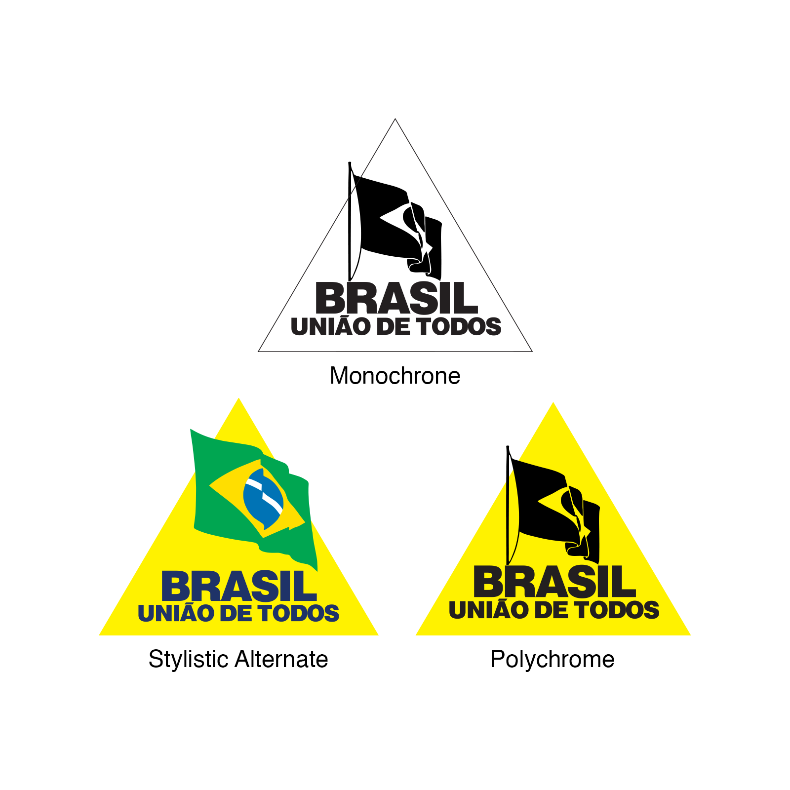
File contents:
marcagov-franco-monochrome.eps
marcagov-franco-polychrome.eps
marcagov-franco-quadrichrome.eps
marcagov-franco-alt-monochrome.eps
marcagov-franco-alt-polychrome.eps
marcagov-franco-alt-quadrichrome.eps
marcagov-franco-slogan-monochrome.eps
marcagov-franco-slogan-polychrome.eps
marcagov-franco-slogan-quadrichrome.eps
| Type | Link |
|---|---|
| .7z | Download |
Navigation

Page instantiated: 2 November 2019.
Date of last revision: 2 November 2019.